The Healing Order
Wellness Center Rebrand
2020

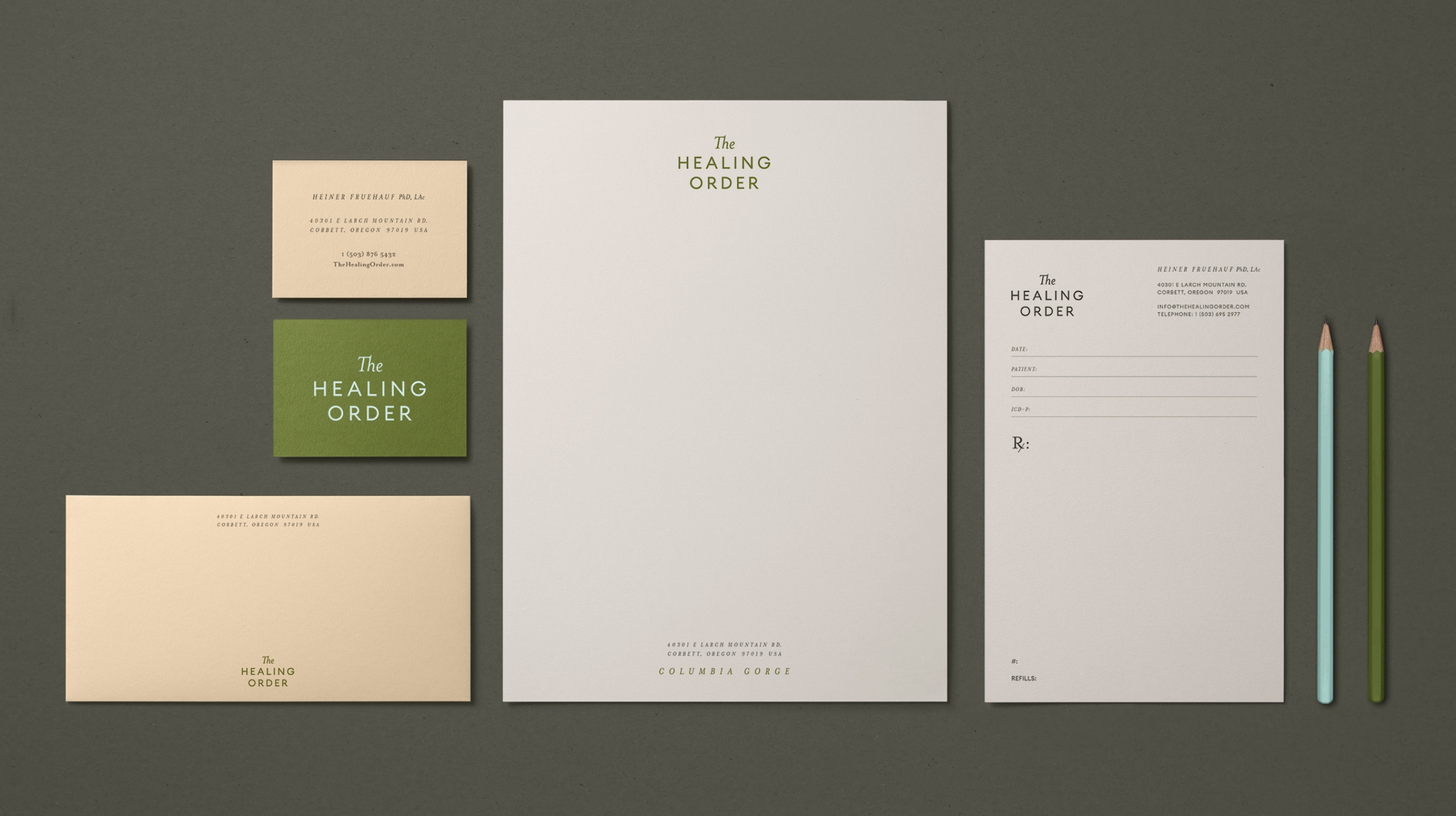
Traditional Chinese Medicine practitioner, Heiner Fruehauf came to us with the mission to rebrand their Hai Shan Clinic into an integrated medical spa, serving a new model of healthcare in the Pacific Northwest. They would provide innovative accommodation alongside traditional and holistic modalities. They needed a modern brand that reimagined the classical “Traditional Chinese Medicine” genre and brought a sense of vitality to a category that is usually considered “alternative.”
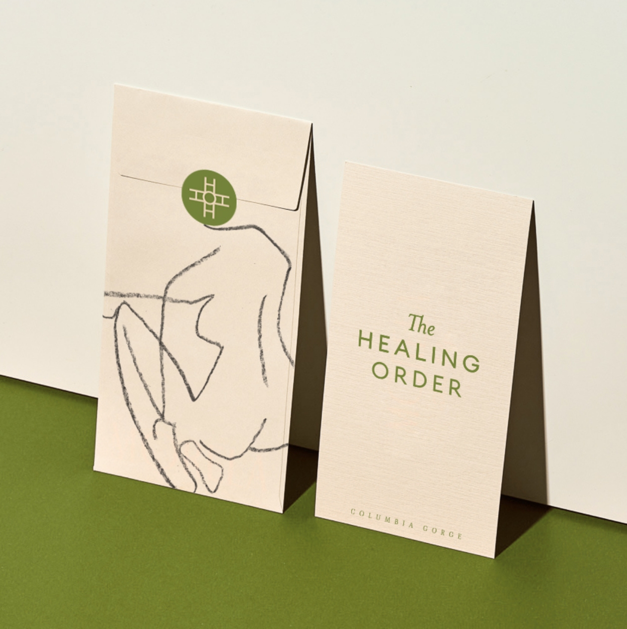
We set out to create a warm and welcoming identity that spoke to connectedness and ease. The wordmark is spacious and simple, evoking a sense of professionalism and confidence that was needed for the emerging brand. The logo mark (the “HO” of Healing Order) represents harmony, centeredness, and a crossroads between the old and new. We created a family of illustrations inspired by the human form, Chinese nature, and the ingredients traditionally used in TCM. Together, the visual identity conveys a soft and timeless presence for their future endeavors.
Role:
Graphic Designer – brand identity, illustrations, website.
Client: The Healing Order
Agency: Red & Co.
Year: 2020
Art Director: Zorica Radovic


JORDENN BAILEY © 2022